histogram
- postprocessinglib.evaluation.visuals.histogram(merged_df: DataFrame = None, df: DataFrame = None, sim_df: DataFrame = None, bins: int = 100, legend: Tuple[str, str] = ('Simulated Data', 'Observed Data'), colors: list[str] = ['r', 'b'], transparency: float = 0.6, z_norm=False, prob_dens=False, fig_size: Tuple[float, float] = (12, 6), font_size: int = 12, title: str = None, labels: Tuple[str, str] = ('Value', 'Frequency'), grid: bool = False, minor_grid: bool = False, save: bool = False, save_as: str = None, dir: str = '/home/docs/checkouts/readthedocs.org/user_builds/nhs-postprocessing/checkouts/stable/docs/source') figure
Plots Histogram for Observed and Simulated Data with Optional Normalization
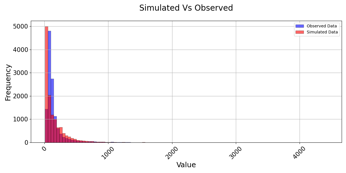
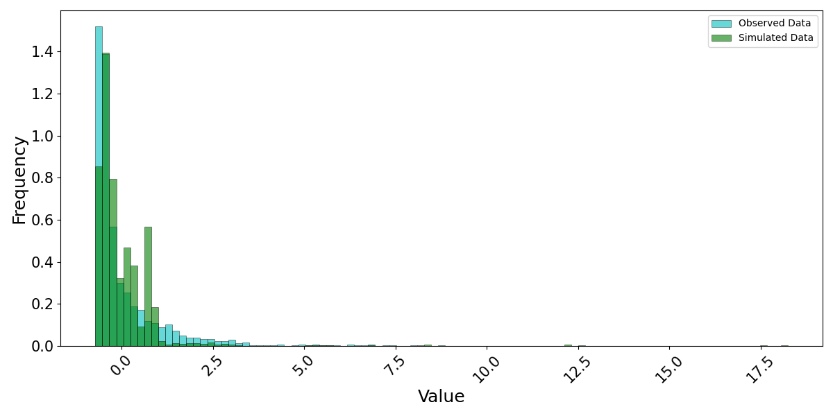
This function generates a histogram comparing the distribution of observed and simulated data, providing insights into their statistical characteristics and variability. The histogram allows users to analyze the frequency distribution of hydrological data, assess model performance, and identify biases in the simulated dataset. The function supports Z-score normalization, which transforms the data into standard deviations from the mean, enabling comparison of datasets with different scales. It also includes an option to plot the histogram as a probability density function (PDF), ensuring that the area under the histogram sums to one, making it easier to compare distributions. Users can customize the number of bins, colors, legend labels, and transparency levels to enhance visualization clarity. The function also allows for gridlines, axis labeling, and automatic or manual saving of plots. This visualization is particularly useful for hydrological modeling, statistical analysis, and understanding deviations between observed and simulated streamflow distributions under various conditions.
- Parameters:
merged_df (pd.DataFrame, optional) – The dataframe containing the series of observed and simulated values. It must have a datetime index.
obs_df (pd.DataFrame, optional) – A DataFrame containing the observed data series if using separate observed and simulated data.
sim_df (pd.DataFrame, optional) – A DataFrame containing the simulated data series if using separate observed and simulated data.
df (pd.DataFrame, optional) – A DataFrame containing the data to be plotted if no merged or separate observed/simulated data are provided.
legend (tuple of str) – A tuple containing the labels for the simulated and observed data, default is (‘Simulated Data’, ‘Observed Data’).
bins (int) – Specifies the number of bins in the histogram.
z_norm (bool) – If True, the data will be Z-score normalized.
prob_dens (bool) – If True, normalizes both histograms to form a probability density, i.e., the area (or integral) under each histogram will sum to 1.
legend – Tuple of length two with str inputs. Adds a Legend in the ‘best’ location determined by matplotlib. The entries in the tuple label the simulated and observed data (e.g. [‘Simulated Data’, ‘Predicted Data’]).
grid (bool) – If True, adds a grid to the plot.
minor_grid (bool) – If True, adds a minor grid to the plot.
title (str) – If given, sets the title of the plot.
labels (tuple of str) – Tuple of two string type objects to set the x-axis labels and y-axis labels, respectively.
figsize (tuple of float) – Tuple of length two that specifies the horizontal and vertical lengths of the plot in inches, respectively.
font_size (int, optional) – Font size for the plot text elements, default is 12.
colors (tuple of str, optional) – Colors for the simulated and observed histograms.
transparency (float, optional) – Transparency level for the histograms, default is 0.6.
save (bool, optional) – Whether to save the plot to a file, default is False.
save_as (str or list of str, optional) – The name or list of names to save the plot as. If a list is provided, each plot will be saved with the corresponding name.
dir (str, optional) – The directory to save the plot to, default is the current working directory.
- Returns:
fig
- Return type:
Matplotlib figure instance and/or png files of the figures.
Examples
>>> from postprocessinglib.evaluation import visuals
>>> # Example 1: Plotting merged data with simulated and observed values
>>> merged_data = pd.DataFrame({...})  # Your merged dataframe
>>> visuals.plot(merged_df = merged_data,
                title='Simulated vs Observed',
                bins = 100,
                labels=['Frequency', 'Value'], grid=True)
>>> # Example 2: Plotting observed and simulated data with custom linestyles and saving the plot
>>> obs_data = pd.DataFrame({...})  # Your observed data
>>> sim_data = pd.DataFrame({...})  # Your simulated data
>>> visuals.plot(obs_df = obs_data, sim_df = sim_data, colors=('g', 'c'), bins = 100, z_norm = True, prob_dens = True,
                save=True, save_as="hist2_example", dir="../Figures")
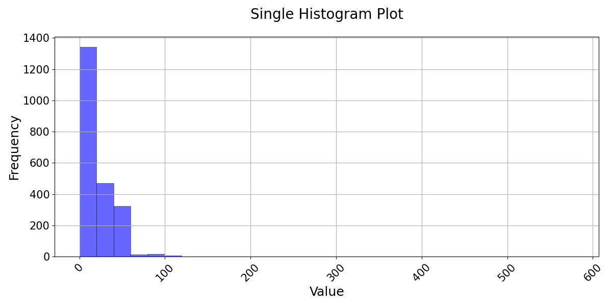
>>> # Example 3: Plotting a single dataframe
>>> single_data = pd.DataFrame({...})  # Your single dataframe (either simulated or observed)
>>> visuals.plot(df=single_data, grid=True, title="Single Histogram Plot", labels=("Time", "Frequency"))