Visualization
postprocessinglib.evaluation.visuals Module
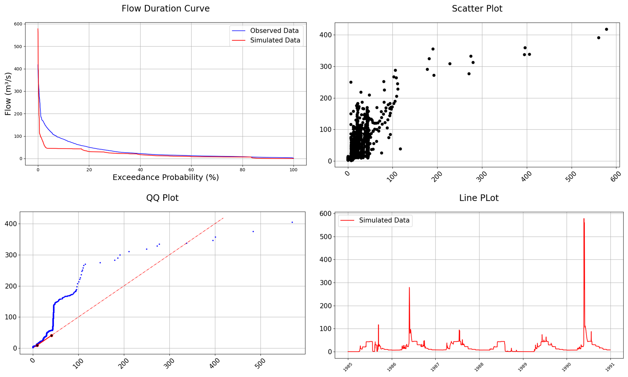
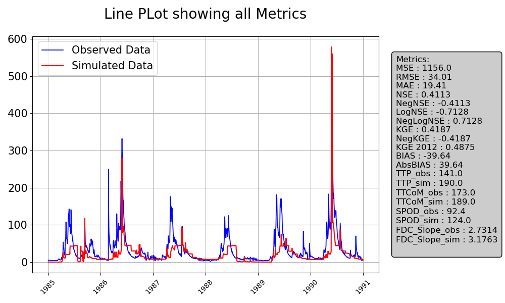
The visual module contains different plotting functions for time series visualization. It allows users to plot hydrographs per station for each stations to allow us visualize the time-series data. These graphs provide a simple and clear way to immeditely identify patterns and discrepancies with model operation. They are also made to very customizable with a lot of options to suit the need of many types of users. Some of them also allow their metrics to be placed beside the plots as shown below:
Functions
|
Plots time-series data with optional confidence bounds. |
|
Calculate the volume under the flow curve using the trapezoidal rule. |
|
Generate a Flow Duration Curve (FDC) comparing observed and simulated streamflow. |
|
Plots Histogram for Observed and Simulated Data with Optional Normalization |
|
Evaluate an expression node or a string containing only a Python expression. |
|
Create a comparison time series line plot of simulated and optionally, observed time series data |
|
Generate a Quantile-Quantile (QQ) plot to compare the statistical distribution of simulated and observed data. |
|
Creates a scatter plot comparing observed and simulated data, with optional features like best fit lines, 45-degree reference lines, and metric annotations. |