bounded_plot
- postprocessinglib.evaluation.visuals.bounded_plot(lines: Union[List[DataFrame], DataFrame], extra_lines: List[DataFrame] = None, upper_bounds: List[DataFrame] = None, lower_bounds: List[DataFrame] = None, step: bool = False, where: str = 'pre', bound_legend: List[str] = None, legend: Tuple[str, str] = None, grid: bool = False, minor_grid: bool = False, title: Union[str, List[str]] = None, labels: Tuple[str, str] = None, linestyles: Tuple[str, str] = ('r-',), linewidth: tuple[float, float] = (1.5,), padding: bool = False, fig_size: Tuple[float, float] = (10, 6), font_size: int = 12, text_size: int = 5, metrices: List[str] = None, transparency: Tuple[float, float] = [0.4], save: bool = False, save_as: Union[str, List[str]] = None, dir: str = '/home/docs/checkouts/readthedocs.org/user_builds/nhs-postprocessing/checkouts/stable/docs/source', metrics_columns: int = 2, metrics_col_spacing: float = 0.16, metrics_row_spacing: float = 0.1, metrics_anchor: Tuple[float, float] = (0.01, 0.95)) figure
Plots time-series data with optional confidence bounds. Generate a bounded time-series plot comparing model streamflow values with confidence intervals.
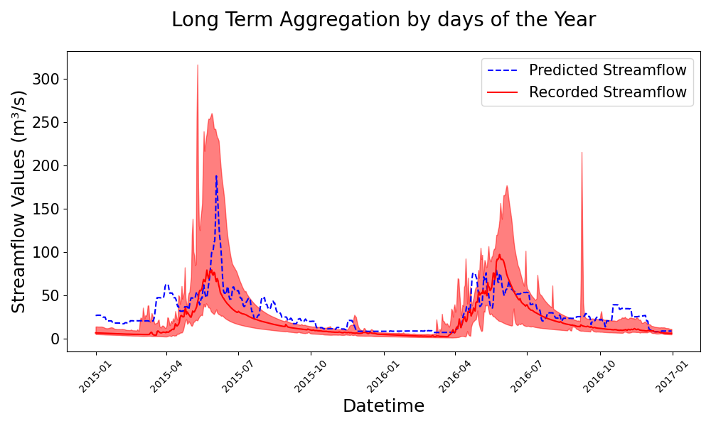
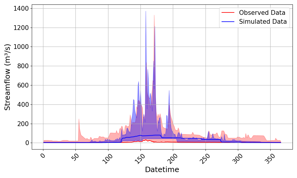
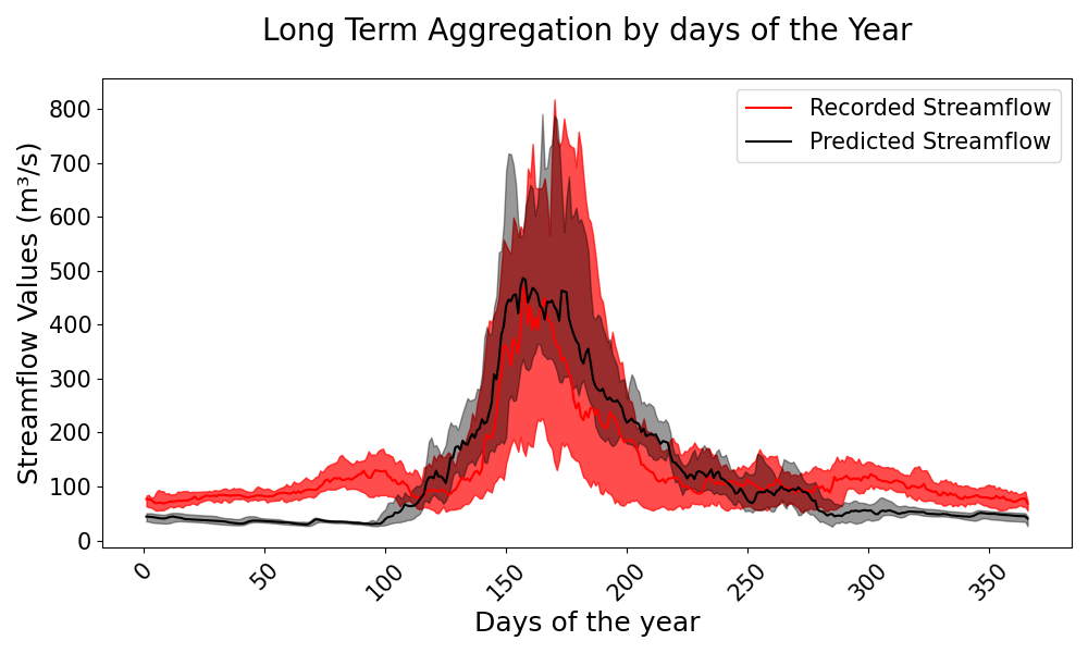
A bounded plot is a time-series visualization that compares observed and simulated hydrological data while incorporating confidence bounds to represent uncertainty. This function plots the streamflow data against Julian days/Datetime, providing insights into seasonal variations and model performance over time. The confidence bounds, which can be defined using minimum-maximum ranges or percentiles (e.g., 5th-95th or 25th-75th percentiles), highlight the range of variability in the observed and simulated datasets. The function allows for flexible customization of labels, legends, transparency, and line styles. This visualization is particularly useful for evaluating hydrological models, identifying systematic biases, and assessing the reliability of simulated streamflow under different flow conditions.
- Parameters:
lines (list of pd.DataFrame) – A list of DataFrames containing the observed and/or simulated data series to be plotted. Each DataFrame must have a datetime index.
upper_bounds (list of pd.DataFrame, optional) – A list of DataFrames containing the upper bounds for each series. If not provided, no upper bounds are plotted. Each bound must be its own list.
lower_bounds (list of pd.DataFrame, optional) – A list of DataFrames containing the lower bounds for each series. If not provided, no lower bounds are plotted. Each bound must be its own list.
extra_lines (list of pd.DataFrame, optional) – A list of DataFrames containing additional lines to be plotted on the same graph. These lines will be plotted with dashed lines. They have no associated bounds. If included though, it will take on the first item in all plot customization options i.e., - linestyles[0] - legend[0] - colors[0], etc. Take note of this when plotting.
step (bool, optional) – Whether to plot the data as a step plot. Default is False, which plots a regular line plot.
where (str, optional) – The location of the step in the step plot. Default is ‘pre’, which means the step occurs before the x value.
bound_legend (list of str, optional) – A list containing the labels for the upper and lower bounds.
legend (tuple of str, optional) – A tuple containing the labels for the simulated and observed data, default is (‘Simulated Data’, ‘Observed Data’).
grid (bool, optional) – Whether to display a grid on the plot, default is False.
minor_grid (bool, optional) – Whether to display a minor grid on the plot, default is False.
title (str, optional) – The title of the plot.
labels (tuple of str, optional) – A tuple containing the labels for the x and y axes.
linestyles (tuple of str, optional) – A tuple specifying the line styles for the simulated and observed data.
linewidth (tuple of float, optional) – A tuple specifying the line widths for each line or extra line. Default is (1.5,).
padding (bool, optional) – Whether to add padding to the x-axis limits for a tighter plot, default is False.
fig_size (tuple of float, optional) – A tuple specifying the size of the figure.
font_size (int, optional) – The font size for the plot text, default is 12.
text_size (int, optional) – The font size for the metrics text on the plot, default is 5.
transparency (list of float, optional) – A list specifying the transparency levels for the upper and lower bounds, default is [0.4, 0.4].
metrices (list of str, optional) – A list of metrics to display on the plot, default is None. Because its a single line being plotted each time, Only single line metrics are calculated and displayed i.e., TTCOM, TTP, SPOD, etc.
save (bool, optional) – Whether to save the plot to a file, default is False.
save_as (str or list of str, optional) – The name or list of names to save the plot as. If a list is provided, each plot will be saved with the corresponding name.
dir (str, optional) – The directory to save the plot to, default is the current working directory.
- Returns:
fig
- Return type:
Matplotlib figure instance
Example
Generate a bounded plot with simulated and observed data, along with upper and lower bounds.
>>> import pandas as pd
>>> import numpy as np
>>> from postprocessinglib.evaluation import visuals
>>> # Create an index for the data
>>> time_index = pd.date_range(start='2025-01-01', periods=50, freq='D')
>>> # Generate sample observed and simulated data
>>> obs_data = pd.DataFrame({
...     "Station1_Observed": np.random.rand(50),
...     "Station2_Observed": np.random.rand(50)
... }, index=time_index)
>>> sim_data = pd.DataFrame({
...     "Station1_Simulated": np.random.rand(50),
...     "Station2_Simulated": np.random.rand(50)
... }, index=time_index)
>>> # Combine observed and simulated data
>>> data = pd.concat([obs_data, sim_data], axis=1)
>>> # Generate sample bounds
>>> upper_bounds = [
...     pd.DataFrame({
...         "Station1_Upper": np.random.rand(50) + 0.5,
...         "Station2_Upper": np.random.rand(50) + 0.5
...     }, index=time_index)
... ]
>>> lower_bounds = [
...     pd.DataFrame({
...         "Station1_Lower": np.random.rand(50) - 0.5,
...         "Station2_Lower": np.random.rand(50) - 0.5
...     }, index=time_index)
... ]
>>> # Plot the data with bounds
>>> visuals.bounded_plot(
...     lines=data,
...     upper_bounds=upper_bounds,
...     lower_bounds=lower_bounds,
...     legend=('Simulated Data', 'Observed Data'),
...     labels=('Datetime', 'Streamflow'),
...     transparency = [0.4, 0.3],
...     grid=True,
...     save=True,
...     save_as = 'bounded_plot_example',
...     dir = '../Figures'
... )
>>> # Adjust a few other metrics
>>> visuals.bounded_plot(
...     lines = merged_df,
...     upper_bounds = upper_bounds,
...     lower_bounds = lower_bounds,
...     title=['Long Term Aggregation by days of the Year'],
...     legend = ['Predicted Streamflow','Recorded Streamflow'],
...     linestyles=['k', 'r-'],
...     labels=['Days of the year', 'Streamflow Values'],
...     transparency = [0.4, 0.7],
... )
>>> # Example 3: Plotting with extra lines
>>> extra_lines = SingleDataFrame()  # Your extra lines DataFrame
>>> visuals.bounded_plot(
...     lines = merged_df,
...     upper_bounds = upper_bounds,
...     lower_bounds = lower_bounds,
...     extra_lines = extra_lines,
...     title=['Long Term Aggregation by days of the Year'],
...     legend = ['Extra Line','Predicted Streamflow'],
...     linestyles=['b--', 'r-'],
...     labels=['Datetime', 'Streamflow Values'],
... )