scatter
- postprocessinglib.evaluation.visuals.scatter(grid: bool = False, minor_grid: bool = False, title: Union[str, List[str]] = None, legend: tuple[str, str] = None, labels: tuple[str, str] = ('Simulated Data', 'Observed Data'), fig_size: tuple[float, float] = (10, 6), best_fit: bool = False, line45: bool = False, mode: str = 'median', models: List[str] = None, font_size: int = 12, text_size: int = 12, merged_df: DataFrame = None, obs_df: DataFrame = None, sim_df: DataFrame = None, metrices: list[str] = None, markerstyle: list[str] = ['bo'], save: bool = False, plot_adjust: float = 0.2, save_as: str = None, metrics_adjust: tuple[float, float] = (1.05, 0.5), dir: str = '/home/docs/checkouts/readthedocs.org/user_builds/nhs-postprocessing/checkouts/latest/docs/source', shapefile_path: Union[str, List[str]] = '', shape_styles: Optional[List[dict]] = None, focus_bbox: Optional[Tuple[float, float, float, float]] = None, focus_pad: float = 0.02, x_axis: DataFrame = None, y_axis: DataFrame = None, metric: str = '', observed: DataFrame = None, simulated: DataFrame = None, markersize: int = 10, cmap: str = 'jet', vmin: Optional[Union[float, Dict[str, float]]] = None, vmax: Optional[Union[float, Dict[str, float]]] = None, metric_options: dict | None = None, components: tuple[str, ...] | None = None) figure
Creates a scatter plot comparing observed and simulated data, with optional features like best fit lines, 45-degree reference lines, and metric annotations.
This function can handle both merged data (observed and simulated in a single DataFrame) and separate observed and simulated data DataFrames. Additionally, it can plot scatter plots over shapefiles for geographic data visualization.
The plot can be customized with various visual features, such as the color map, gridlines, markers, and axis labels. The function also allows adding a linear regression best-fit line, a 45-degree line, and annotations for metrics. The plot can be saved to a file if desired.
- Parameters:
grid (bool, optional) – Whether to display a grid on the plot, default is False.
minor_grid (bool, optional) – Whether to display a minor grid on the plot, default is False.
title (str, optional) – The title of the plot.
labels (tuple of str, optional) – A tuple containing the labels for the simulated and observed data, default is (‘Simulated Data’, ‘Observed Data’).
legend (tuple of str, optional) – A tuple containing the labels for the x and y axes.
fig_size (tuple of float, optional) – A tuple specifying the size of the figure.
font_size (int, optional) – Font size for the plot text, default is 12.
merged_df (pd.DataFrame, optional) – The dataframe containing the series of observed and simulated values. It must have a datetime index.
obs_df (pd.DataFrame, optional) – A DataFrame containing the observed data series if using separate observed and simulated data.
sim_df (pd.DataFrame, optional) – A DataFrame containing the simulated data series if using separate observed and simulated data.
metrices (list of str, optional) – A list of metrics to display on the plot, default is None.
markerstyle (str) – List of two strings that determine the point style and shape of the data being plotted
metrics_adjust (tuple of float, optional) – A tuple specifying the position for the metrics on the plot.
plot_adjust (float, optional) – A value to adjust the plot layout to avoid clipping.
best_fit (bool) – If True, adds a best linear regression line on the graph with the equation for the line in the legend. If there are multiple columns, the best fit line will be added to each column i.e, multiple best fit lines.
line45 (bool) – IF True, adds a 45 degree line to the plot and the legend. There is only one 45 degree line for all columns.
save (bool, optional) – Whether to save the plot to a file, default is False.
save_as (str or list of str, optional) – The name or list of names to save the plot as. If a list is provided, each plot will be saved with the corresponding name.
dir (str, optional) – The directory to save the plot to, default is the current working directory.
shapefile_path (str, optional) – The path to a shapefile on top of which the scatter plot will be drawn.
x_axis (pd.DataFrame, optional) – Used when plotting with a shapefile to determine the x-axis values.
y_axis (pd.DataFrame, optional) – Used when plotting with a shapefile to determine the y-axis values.
metric (str, optional) – The metric used to generate the color map for the scatter plot.
observed (pd.DataFrame, optional) – Used to calculate the metric for the scatter plot.
simulated (pd.DataFrame, optional) – Used to calculate the metric for the scatter plot.
markersize (int, optional) – Size of the markers in the shapefile scatter plot. Default is 10.
mode (str, optional) – The mode used to calculate the metric for the scatter plot. Default is ‘median’. But it can be ‘models’ or ‘mean’. It can also be models used to indicate that the metric is to be calculated for each model as specified in the models list.
models (list of str, optional) – A list of model names to be used when calculating the metric for the scatter plot. Default is None. It is only used when mode is ‘models’.
cmap (string, optional) – Used to determine the color scheme of the color map for the shapefile plot
vmin (float, optional) – Minimum colormap value
vmax (float, optional) – Maximum colormap value
- Returns:
fig
- Return type:
Matplotlib figure instance
Example
Generate a scatter plot using observed and simulated data:
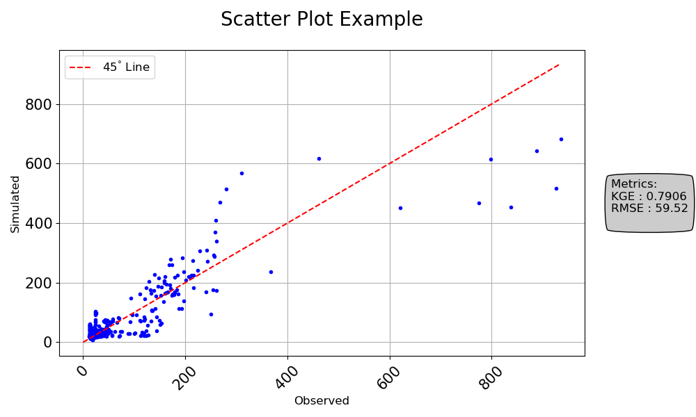
>>> import numpy as np
>>> import pandas as pd
>>> from postprocessinglib.evaluation import visuals
>>> #
>>> # Create test data
>>> index = pd.date_range(start="2022-01-01", periods=10, freq="D")
>>> obs_df = pd.DataFrame({
>>>     "Station1": np.random.rand(10),
>>>     "Station2": np.random.rand(10)
>>> }, index=index)
>>> #
>>> sim_df = pd.DataFrame({
>>>     "Station1": np.random.rand(10),
>>>     "Station2": np.random.rand(10)
>>> }, index=index)
>>> #
>>> # Call the scatter plot function
>>> visuals.scatter(
>>>     obs_df=obs_df,
>>>     sim_df=sim_df,
>>>     labels=("Observed", "Simulated"),
>>>     title="Scatter Plot Example",
>>>     grid=True,
>>>     metrices = ['KGE','RMSE'],
>>>     line45=True,
>>>     markerstyle = 'b.',
>>>     save=True,
>>>     save_as="scatter_plot_example_1.png"
>>> )
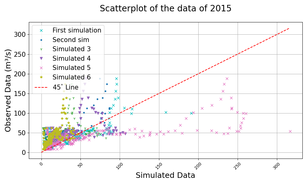
>>> visuals.scatter(
>>>     merged_df=merged_df,
>>>     labels=("Observed Data", "Simulated Data"),
>>>     title="Scatterplot of the data of 2015",
>>>     grid=True,
>>>     line45=True,
>>>     markerstyle = 'cx',
>>> )
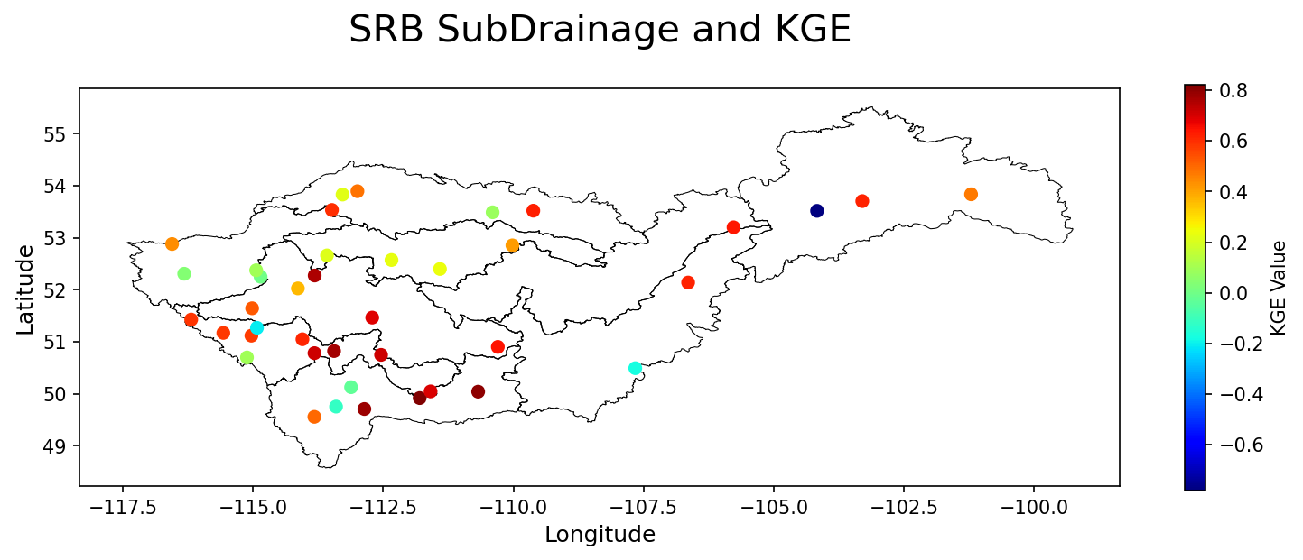
>>> shapefile_path = r"SaskRB_SubDrainage2.shp"
>>> stations_path = 'Station_data.xlsx'
>>> Station_info = pd.read_excel(io=stations_path)
>>> .
>>> # plot of a few stations in the SRB showing the disparities in their KGE
>>> visuals.scatter(shapefile_path = shapefile_path,
                    title = "SRB SubDrainage and KGE",
                    x_axis = Station_info["Lon"],
                    y_axis = Station_info["Lat"],
                    metric = "KGE",
                    fig_size = (24, 20),
                    observed = DATA_2["DF_OBSERVED"],
                    simulated = DATA_2["DF_SIMULATED"],
                    labels=['Longitude', 'Latitude'],
                    cmap = 'jet'
                )