qqplot
- postprocessinglib.evaluation.visuals.qqplot(grid: bool = False, minor_grid: bool = False, title: str = None, labels: tuple[str, str] = None, fig_size: tuple[float, float] = (10, 6), font_size: int = 12, method: str = 'linear', legend: list[str] = None, linewidth: tuple[float, float] = (1.5, 2.5), merged_df: DataFrame = None, obs_df: DataFrame = None, sim_df: DataFrame = None, linestyle: tuple[str, str, str] = ('b:', 'r-.', 'r-'), quantile: tuple[int, int] = (25, 75), q_labels: tuple[str, str, str] = ('Range of Quantiles', 'IQR'), save: bool = False, save_as: str = None, dir: str = '/home/docs/checkouts/readthedocs.org/user_builds/nhs-postprocessing/checkouts/latest/docs/source') figure
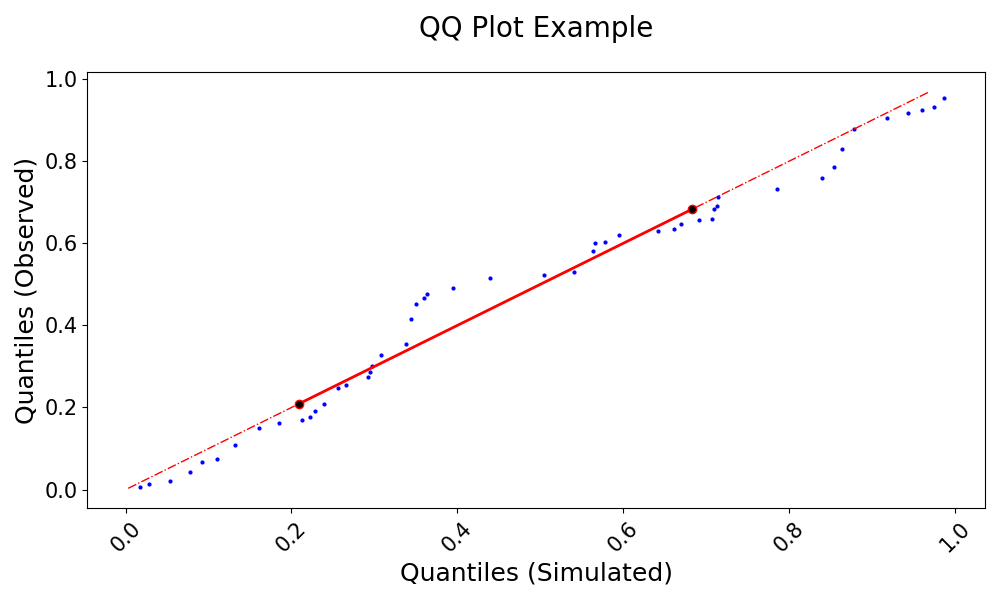
Generate a Quantile-Quantile (QQ) plot to compare the statistical distribution of simulated and observed data.
A Quantile-Quantile (QQ) plot is a graphical technique for assessing whether two datasets come from the same distribution by plotting their quantiles against each other. If the datasets have identical distributions, the points should fall along the 1:1 line. This function calculates and visualizes the quantiles of observed and simulated streamflow data, interpolating if necessary, and marks key statistical features such as the interquartile range. By comparing the empirical quantiles of simulated and observed data, the QQ plot helps evaluate the performance of hydrological models in reproducing streamflow distributions, highlighting potential biases and differences in variability. The function also allows for flexible customization of labels, legends, transparency, and line styles. It is an essential tool in hydrology and environmental sciences for assessing the agreement between measured and modeled hydrological variables.
- Parameters:
grid (bool, optional) – Whether to display a grid on the plot, default is False.
minor_grid (bool, optional) – Whether to display a minor grid on the plot, default is False.
title (str, optional) – The title of the plot.
labels (tuple of str, optional) – A tuple containing the labels for the x and y axes
fig_size (tuple[float, float]) – Tuple of length two that specifies the horizontal and vertical lengths of the plot in inches, respectively.
font_size (int, optional) – Font size for the plot text, default is 12.
method (str) – Determines whether the quantiles should be interpolated when the data length differs. If True, the quantiles are interpolated to align the data lengths between the observed and simulated data, ensuring accurate comparison. Default is Linear.
legend (bool) – Whether to display the legend or not. Default is False
llinewidth (tuple of float, optional) – A tuple specifying the line widths for the simulated and observed data.
merged_df (pd.DataFrame, optional) – The dataframe containing the series of observed and simulated values. It must have a datetime index.
obs_df (pd.DataFrame, optional) – A DataFrame containing the observed data series if using separate observed and simulated data.
sim_df (pd.DataFrame, optional) – A DataFrame containing the simulated data series if using separate observed and simulated data.
linestyle (tuple[str, str, str]) – List of three strings that determine the point style and shape of the data being plotted
quantile (tuple[int, int]) – Range of quantiles to plot, with values between 0 and 1. The first value is the lower quantile, and the second is the upper. Default is (25, 75).
q_labels (tuple[str, str, str]) – Labels for the x-axis (simulated quantiles) and y-axis (observed quantiles). Default is [‘Quantiles’, ‘Range of Quantiles’, ‘Inter Quartile Range’].
save (bool, optional) – Whether to save the plot to a file, default is False.
save_as (str or list of str, optional) – The name or list of names to save the plot as. If a list is provided, each plot will be saved with the corresponding name.
dir (str, optional) – The directory to save the plot to, default is the current working directory.
Example
Generate a QQ plot to compare observed and simulated data distributions:
>>> import numpy as np
>>> import pandas as pd
>>> from postprocessinglib.evaluation import metrics
>>> #
>>> # Create test data
>>> index = pd.date_range(start="2022-01-01", periods=50, freq="D")
>>> obs_df = pd.DataFrame({
>>>     "Station1": np.random.rand(50),
>>>     "Station2": np.random.rand(50)
>>> }, index=index)
>>> #
>>> sim_df = pd.DataFrame({
>>>     "Station1": np.random.rand(50),
>>>     "Station2": np.random.rand(50)
>>> }, index=index)
>>> #
>>> # Call the QQ plot function
>>> visuals.qqplot(
>>>     obs_df=obs_df,
>>>     sim_df=sim_df,
>>>     labels=("Quantiles (Simulated)", "Quantiles (Observed)"),
>>>     title="QQ Plot Example",
>>>     save=True,
>>>     save_as="qqplot_example.png"
>>> )
>>> visuals.qqplot(
>>>     merged_df=merged_df,
>>>     labels=("Quantiles (Simulated)", "Quantiles (Observed)"),
>>>     title="QQ Plot of the simulated Dataset compared to the observed from 2000 till 2005",
>>>     grid=True,
>>>     save=True,
>>>     save_as="qqplot_example_2.png"
>>> )